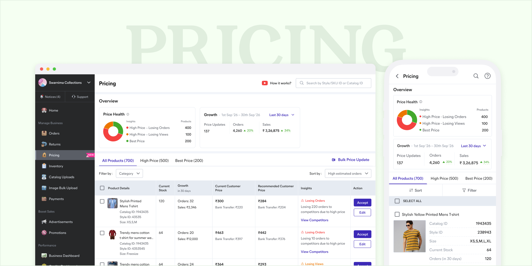
Price Recommendation Tool
From a recommendation tool sellers overrode to a competitive platform for growth
1-minute summary
Pricing had underperformed for months. Only about a third of sellers who visited the dashboard came to Pricing, and many who came once did not return. Of those who acted, only 40% directly accepted the recommendation, and the rest edited the price by ₹1 to ₹2, a change too small to move anything.
I owned design, research and problem scoping for the overhaul, working with product managers, a business analyst, developers and key account managers. I pushed to diagnose before redesigning. Starting with a survey to form strong hypotheses, field research then named the distrust: unclear deductions, since the price shown was not the bank transfer that would land, and sellers being unable to judge whether the cheaper competitor was comparable. Further we ran a controlled experiment which showed which evidence actually impacted the seller's decision, and I rebuilt the tool around it, turning a recommendation feed into a competitive platform for order and sale growth.
Shipped on desktop first, where about 70% of Pricing actions happen, then on mWeb. Measured in Mixpanel on a weekly cadence against a control group, before scaling to all sellers.
90%
increase in direct acceptance
7%
order contribution, from 0.3%
28pp
view realisation, from 62pp
Problem
A tool sellers had quietly stopped believing
Pricing is a recommendation tool in the seller dashboard, built to help sellers price against competition and market trends. This project was a significant overhaul of it.
Picture a seller listing jewellery across several platforms. On Meesho, growth has stalled despite following every recommendation, while other sellers reduce the price and take the orders, and nothing in the tool clearly explains the gap. That is how trust drains: acceptance stayed low because the drops were not producing growth, and competition realisation stayed low because the evidence was never shown.
Who are these sellers?
Sellers split broadly by catalog capacity and size of business. About 50 to 60% of the ~800k active seller base is large scale, and the platform is pushing further into smaller towns with 0% commission and listings for non-GST sellers.
Small scale sellers run the business from home or a small store with 100 to 200 listings, and carry a growth mindset, learning the tools that help them grow. Medium scale sellers have an offline shop and list across different apps with 500 to 1,000 listings, balancing growth and profit, with capital to invest in ads. Large scale sellers run offline stores with a warehouse listed online at 5,000+ listings, with a strong profit mindset for high-ROI tools and growth hacks.
Discovery
Tracing the distrust to its source
Discovery ran in three parts, each narrowing one question: why are sellers not accepting the recommendation? A data deep dive and UX audit set the baseline: working with a data analyst, I pulled what the tool was actually producing.
- 62pp
- view realisation score
- 40%
- direct acceptance
- ~0.3%
- order contribution
The audit marked where the flow lost the seller: there was no clarity around where the growth and impact were coming from, which and how many recommendation acceptances actually led to that impact, the price edit had information overload with no clear hierarchy nudging sellers to the right price point, and finally on compare price there was no clarity around why the other competitor was selling at a cheaper rate.
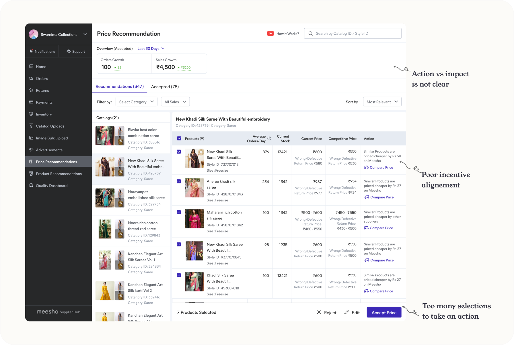
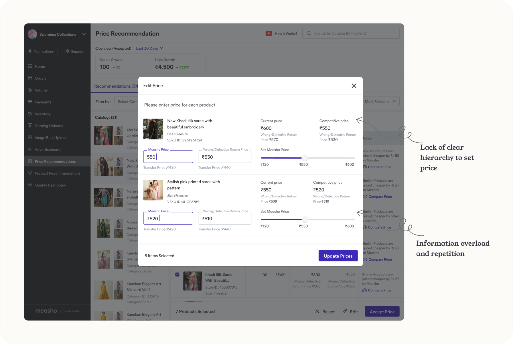
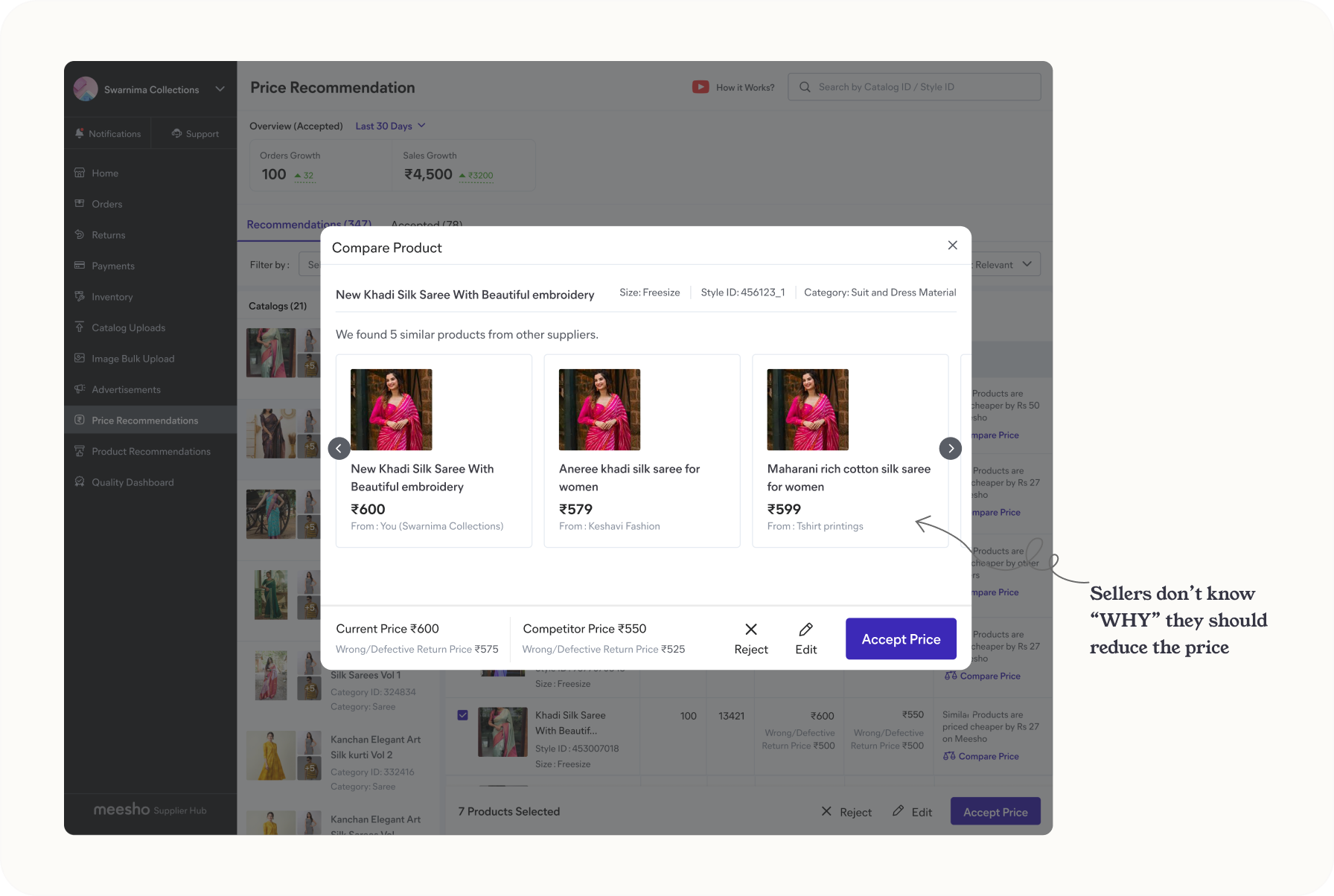
A survey and a competitor analysis ran in parallel to turn that baseline into hypotheses. 1,092 sellers responded.
- 57% manually searched their own product to find the real final price.
- 55% assumed cheaper competitors were simply lower quality.
- 40% said dropping prices had not grown their orders.
Alongside the survey I studied how Flipkart and Amazon handle price guidance, and I further conducted seller visits along with my product and business counterparts and tested those hypotheses in person. I sat with 12+ sellers across Bangalore, Surat and Delhi, watching them run their day and price their products.
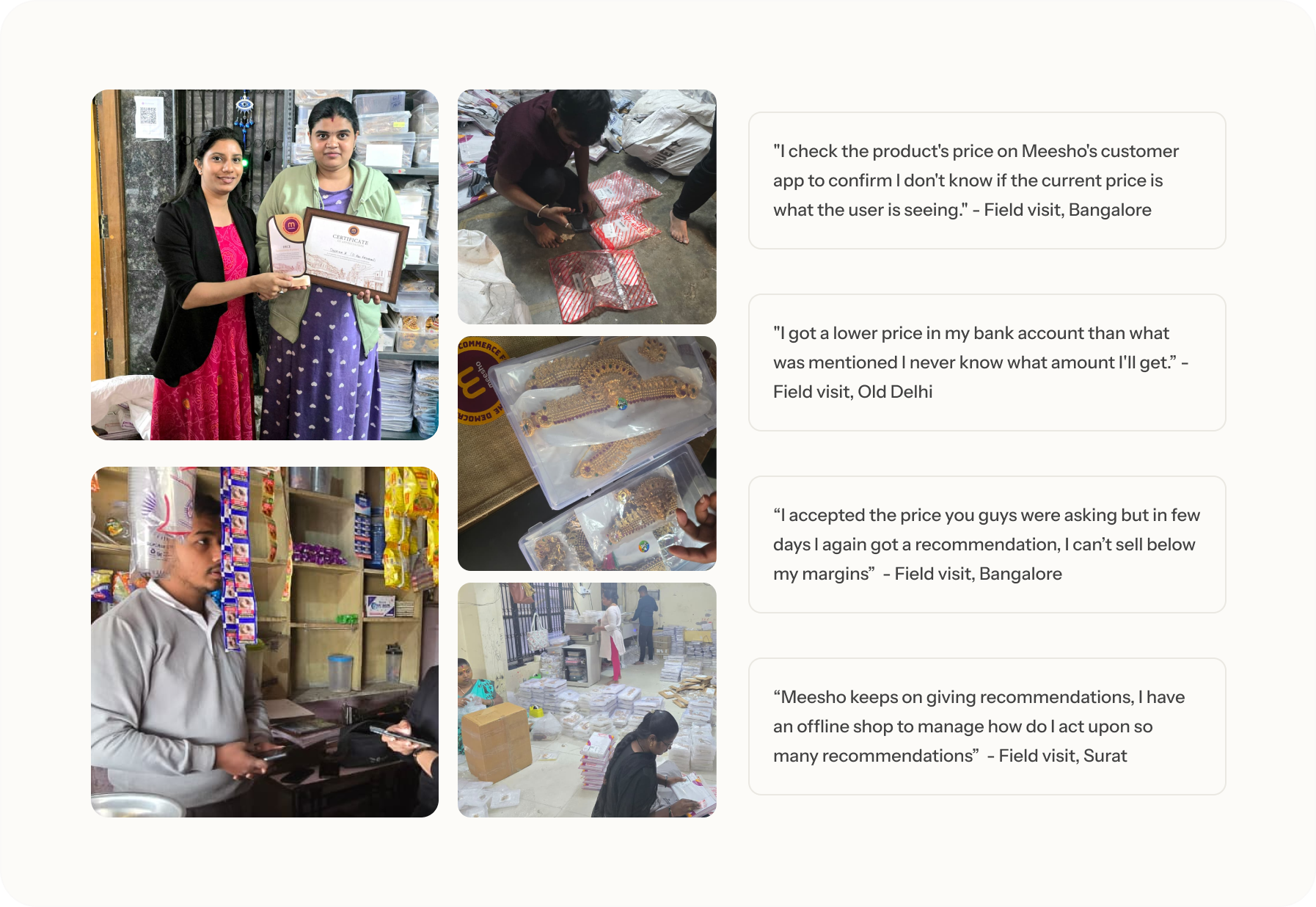
Based on the UX audit, the survey and what sellers told us during the field visits, I collated all the findings and grouped them into three roots of distrust.
- Transparency gap
- The price shown was not exactly the bank transfer they would receive; there are deductions including zonal shipping, GST and delivery fees, which were not presented upfront.
- Proof gap
- Sellers could find the cheaper competition, but not judge whether it was comparable. They either opened the consumer app to read the product detail themselves, or assumed a lower price meant lower quality.
- Payoff gap
- When sellers drop the prices, orders often did not grow, so the tool's core promise kept failing.
Once we had clarity around the core problem areas, I worked on scoping down the entire revamp based on the urgency and relevancy of the solution. For this I collaborated with product and engineering counterparts to ensure we planned an actionable and deliverable roadmap.
- V0 · Competition realisation
- Sellers did not treat pricing as a growth lever, and could not find their competition on the platform.
- V1 · UX optimisation
- The price update process was lengthy and tedious, with no directional nudge to act strategically.
- V2 · Automation
- Large recommendation volumes are hard to update by hand, and sellers work across multiple channels.
Experiment
Learning which evidence actually changes a mind
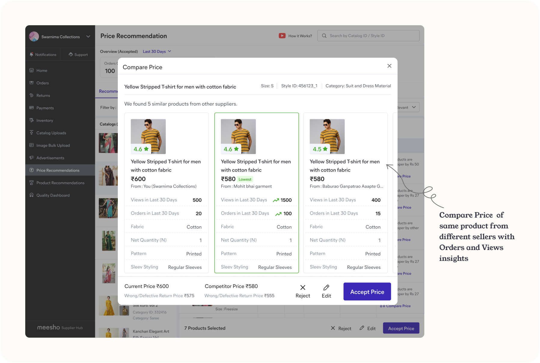
Rather than design the whole tool, which could take months of effort to cover every edge and error scenario, a controlled experiment ran first: four variants against a control, each surfacing different evidence on the landing page and compare price view.
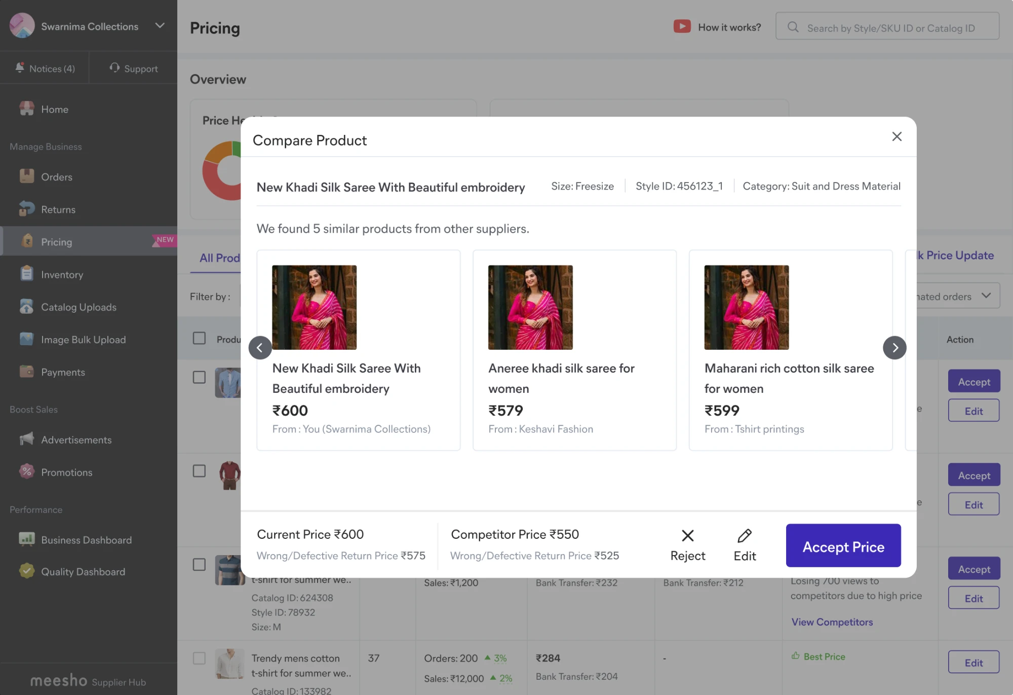
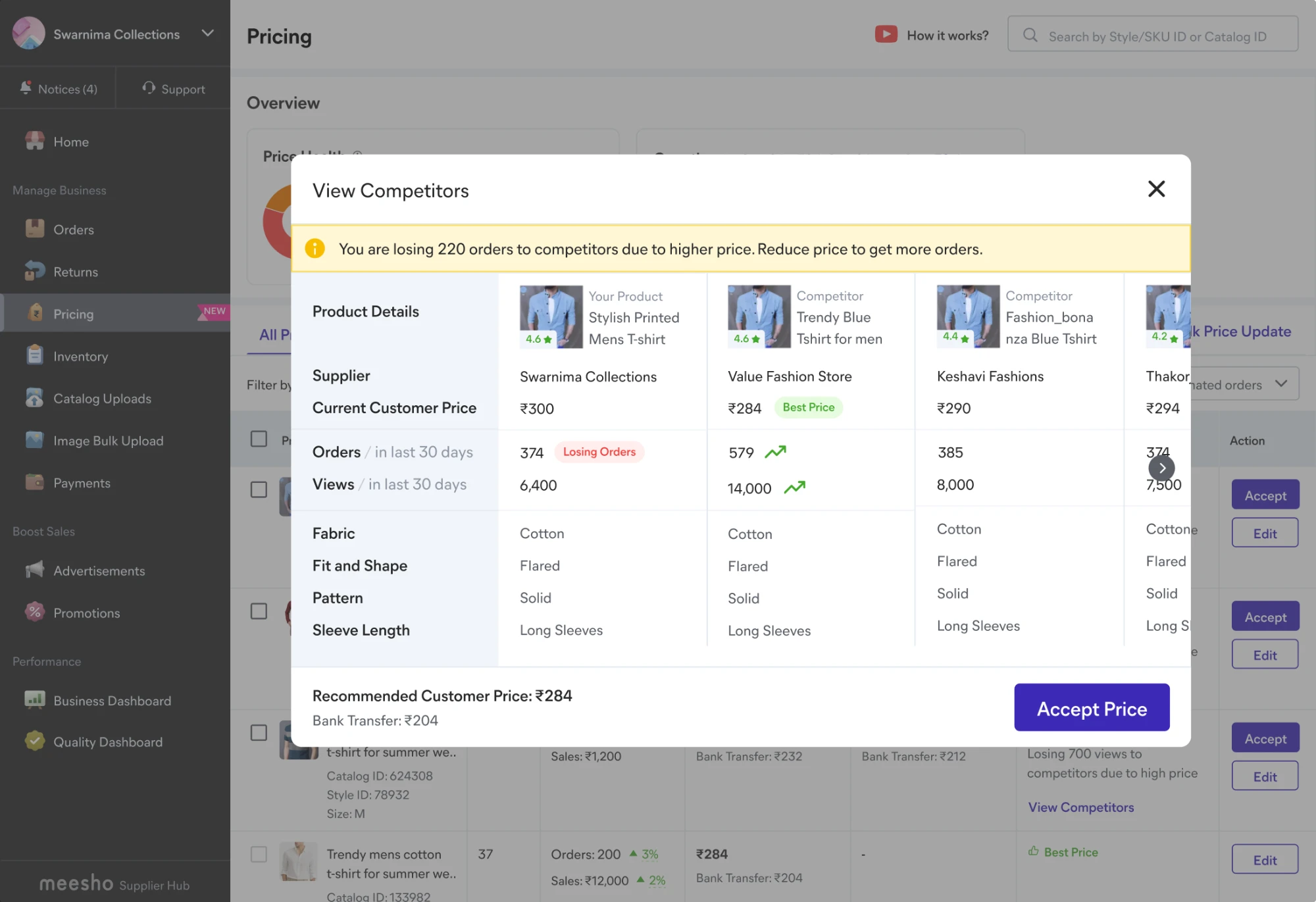
Based on the research findings and the collated gaps, which included a lack of clarity around competition and around whether order and sale growth is tied to a price drop, I proposed the hypothesis of showing the numbers for visibility, something sellers were already figuring out themselves with guesswork and external tools. Visible orders and views moved acceptance hardest. The quality and rating signals that had come through loudest in research did not win.
Sellers were not persuaded by "their product is good." They were persuaded by "their product is selling, and yours isn't."
Approach
A tool that earns trust shouldn't sound equally sure of everything
The tool surfaced every recommendation with the same weight, but it was not equally confident in all of them. I pushed for a different default: show the stronger recommendations, and stand behind each one. I worked along with the tech lead and product counterparts to re-evaluate the recommendation generation logics, how we had segregated types of recommendations, and what the ideal cool-off period should be, which was also called out during research: "I have an offline shop to manage, I can't act upon so many recommendations." That single principle reshaped the product in three ways.
- Bifurcation
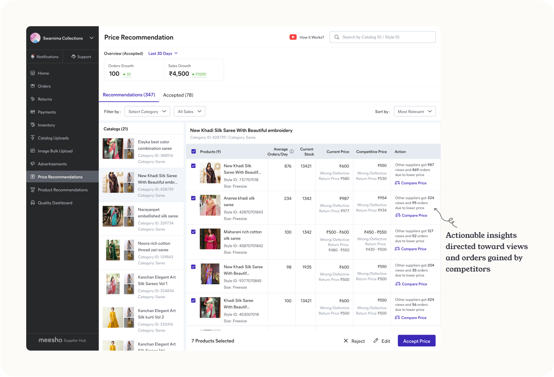
- Recommendations split by strength and reason, into Losing Orders and Losing Views.
- One surface
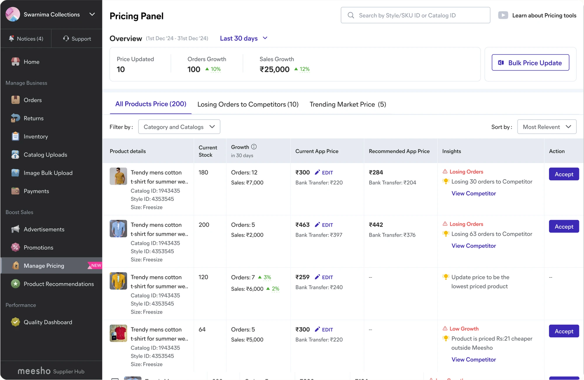
- All of the seller's products brought into Pricing, so there was no reason to leave for Inventory, which was becoming a cannibalisation point for our product. A price health check, not just a recommendation feed.
- Sane cadence
- Fixed the erratic nudging that re-prompted sellers on prices they had just set.
Early explorations
Decision 1
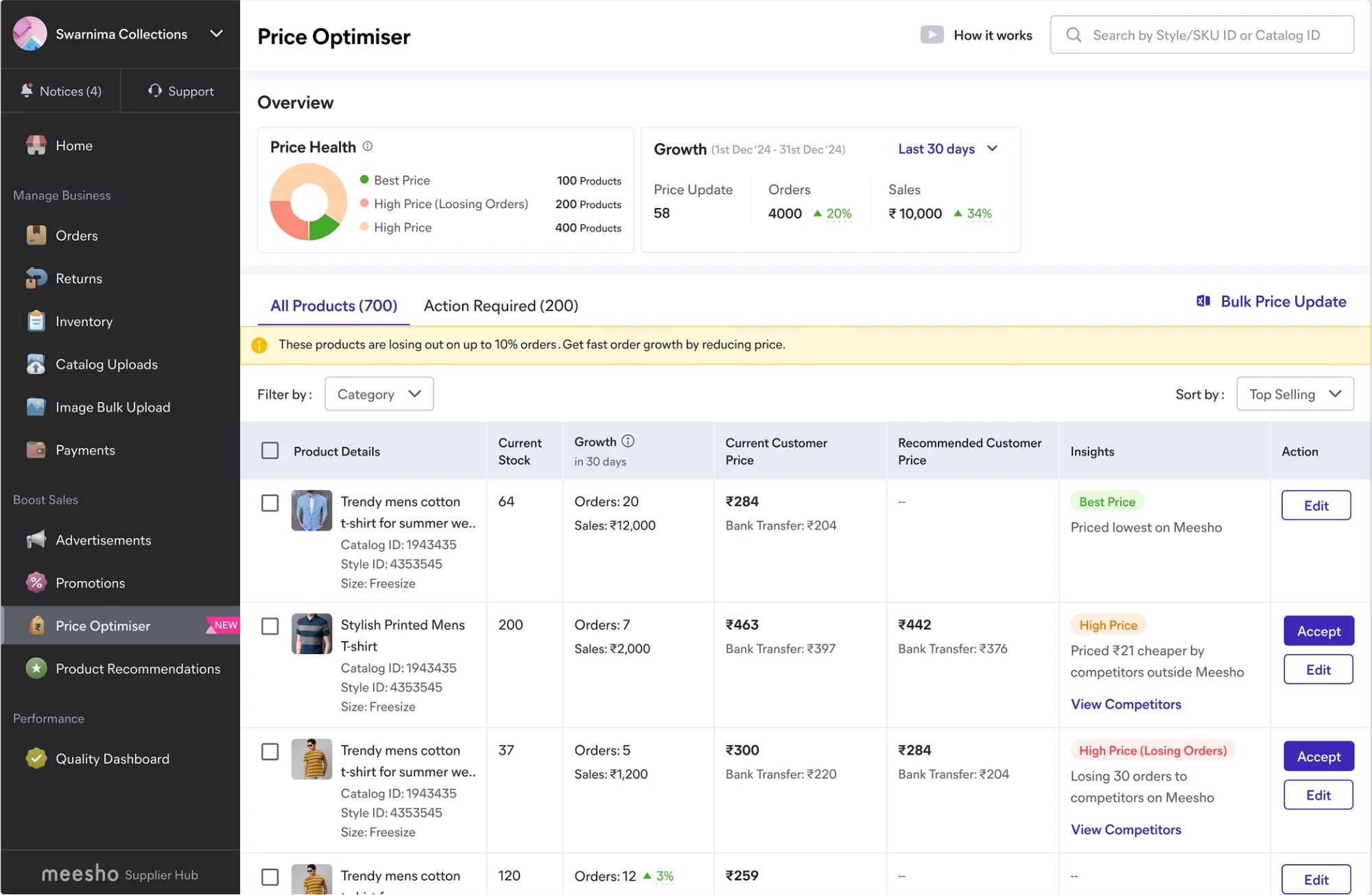
Product-first, not catalog-first. Catalog-first had precedent and PM preference, but capped sellers to one catalog while the biggest run thousands of SKUs. Product-first meant fewer steps, and it enabled cross-catalog bulk-accept.
Settled by a hi-fi prototype test
Decision 2
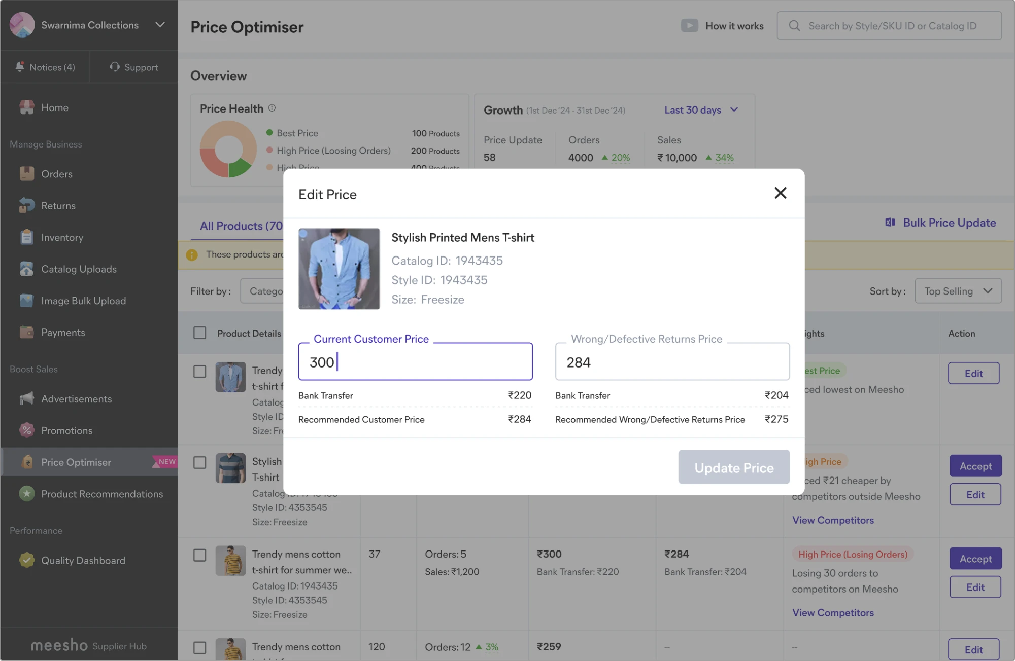
Where edit lives. A separate action column pulled the seller away from the number they were already reading. Editing inline, beside the current price, meant fewer eye-jumps to make a change.
Settled by a hi-fi prototype test
Decision 3
Tab names sellers could parse. The internal taxonomy of "Critical Price Recommendations" versus "Other" meant nothing to them. Losing Orders and Losing Views won, because a seller thinks in orders and views.
Settled by a seller comprehension test
Final designs
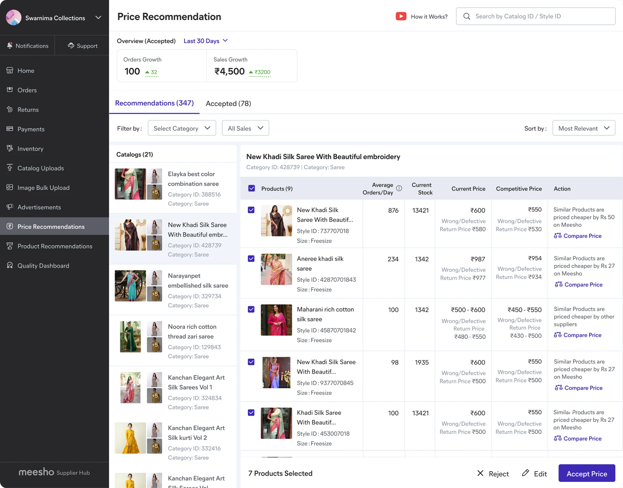
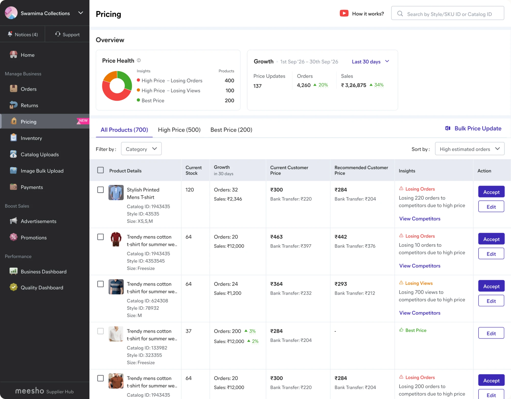
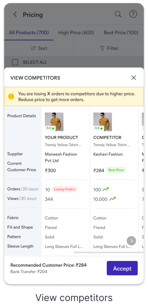
The recommendation now carries its proof and the real payout, so the number the tool gives is the number the seller can check.
Impact
A recommendation sellers act on
90%
direct recommendation acceptance, from 40%
7%
order contribution, from 0.3% against a 2% goal
28pp
view realisation score, from 62pp, nearly halved
These were not just UI wins, they were trust wins. Sellers acted because the tool finally showed them the full picture: what they would actually earn, who they were losing orders to, and a recommendation it only made when confident enough to stand behind.
Mweb version
Mobile design
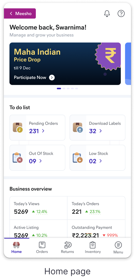
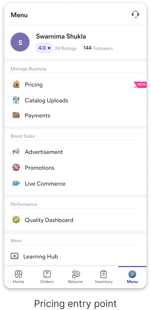
Since about 30% of sellers use the web app to take actions, I worked on the mWeb version of Pricing after the desktop launch. Below is the final flow.
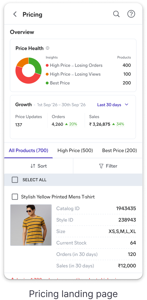
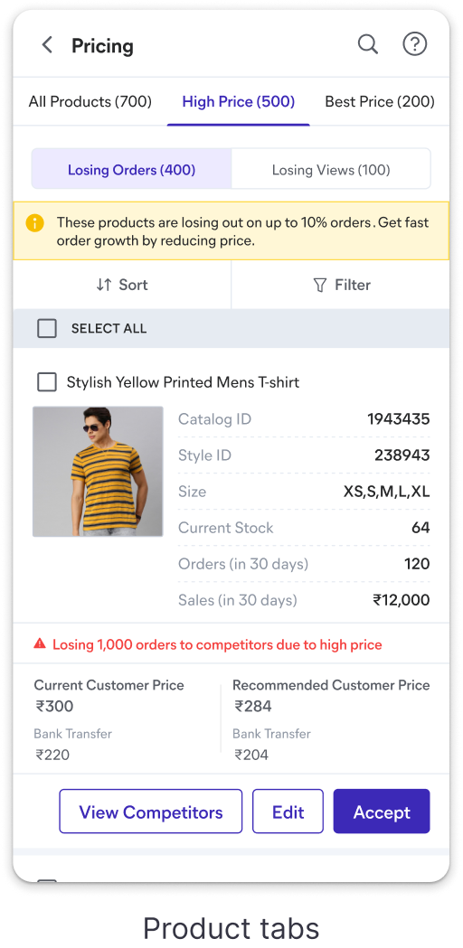
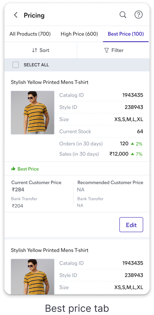

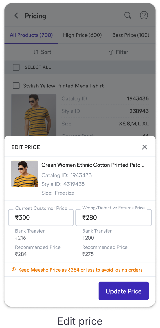
Happy moments
Being user first
Connecting with users was one of the best phases of this project. I went to multiple locations across Bangalore, Surat and Delhi, visiting warehouses and stores, not just to understand this project but to see their day to day routine and where the hassle really sits.
What this hardened
Question the brief before accepting it. The whole project turned on stopping to ask what was actually being solved, and why, before drawing anything.
Design gets decided upstream. The choices that bent this project most were not pixel choices, they were the cadence and conviction conversations that came from sitting with engineering, product and analysts early.
There is more to this work...
Trade-offs, iterations, prioritisation and shipping and the stuff that didn't ship.
Get in touch for a walkthrough.