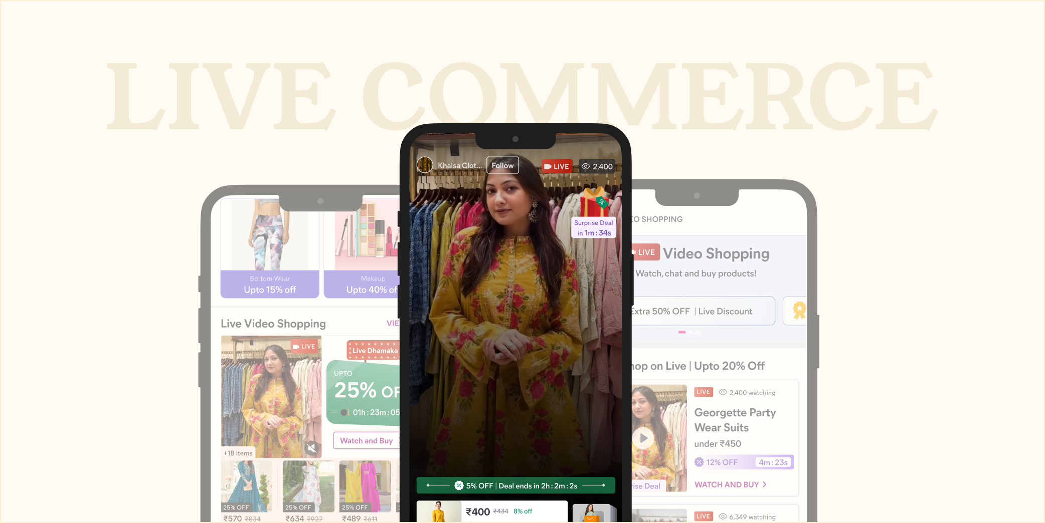
Live Video Shopping
Providing immersive and entertaining shopping experience, via in-app seller interactions.
1-minute summary
Despite entry points across the app, only a quarter of the 18 Mn experiment audience was showing up to Live video. Out of them only 2% would make the purchase and rest would drop off within 120s of the video.
Users didn't know where the feature existed in the app, even when they noticed the static banners with 1-2 product images, it read a huge time commitment to watch for a single product, which was a wrong perception. Even a discount couldn't help, because the key value prop of watching live, making an informed decision and viewing multiple products was not clear.
I proposed and designed autoplaying widget which is live streams of sellers showing products, and also ensuring variety perception is captured at L0 level. I collaborated with tech to resolve constraints for low internet areas and worked on in-stream discount to help sellers engage users throughout the stream and gain maximum profit.
During the 2 months tenure, I collaborated with 2 Product Managers, 1 Business Analyst, 2 Developers and a QA for this project.
In the first week of experiment launch we noticed huge impact. We were awarded as “star team of the quarter” for this project.
71%
increment in view activation from 11%
33%
increment in order activation from 2%
Background
Bridging the gap between traditional and online shopping
Traditional online shopping often lacks the engagement and emotional connection that in-store experiences provide. Customers can feel uncertain about their purchases, leading to higher drop offs and lower customer satisfaction.
Live video shopping addresses this problem by bringing the in-store experience to the digital realm, allowing customers to see products in action, ask questions in real-time, get super-high discounts, and receive personalized recommendations, resulting in more engagement, informed decisions and increased trust in the shopping process.
When I joined this team, we had already launched first version of Live video shopping for users, but based on ~18Mn user base for which the feature was scaled when I looked at the stats it was directing otherwise.
80%
of users who entered live video via static banner, dropped off within 10 seconds
11%
reached to view activation stage, by sticking with the video for atleast 120s
2%
of view activated users actually placed an order, despite heavy offers
Early designs
A known habit, a new place
The assumption was that Meesho's value-conscious shopper, often tier 2 or a smaller town, scanning for the best price on something they already want, had no appetite for live shopping. The evidence said otherwise: live commerce was already working for value-seeking audience for SEA apps and Indian audience from Tier3/4 routinely watched live selling on Facebook and bought from it.
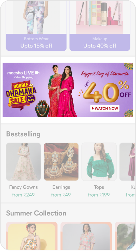
Entry point to this feature were Whatsapp nudges, homepage banners (updates every 3rd day to ensure freshness otherwise CTR drops by 15-20%).
During my UX Audit, I realised among other banners available on the page, it was extremely difficult to differentiate this banner over scroll if someone is just skimming through content that too when we have a TG who doesn't read lot of text and rely heavily on image.
Learnings
Static banner experiment
We had ~160 unique streams/day with 10-12 streams at a time and seller would invest around 90 mins talking to users, showing their products and resolving their queries. Here are few insights I got from the Analytic team to understand what's working for users currently.
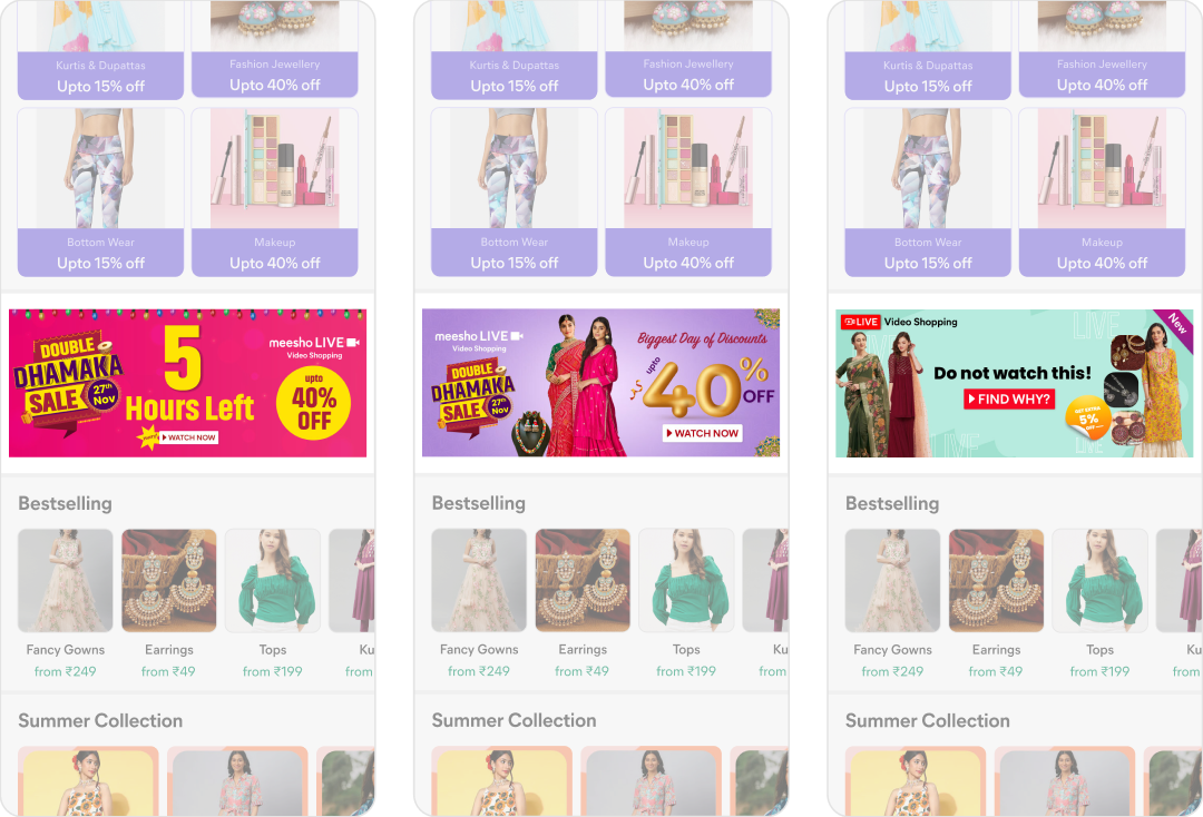
Minimalist design (focus on communicating only one message) gives best CTRs. Priority order of key attributes- discount > FOMO (time/ surprise) > PID > Live Video. Product is very important in channelising the intent, sets some sort of expectations in user's mind.
Brainstorming
Navigating through ambiguity
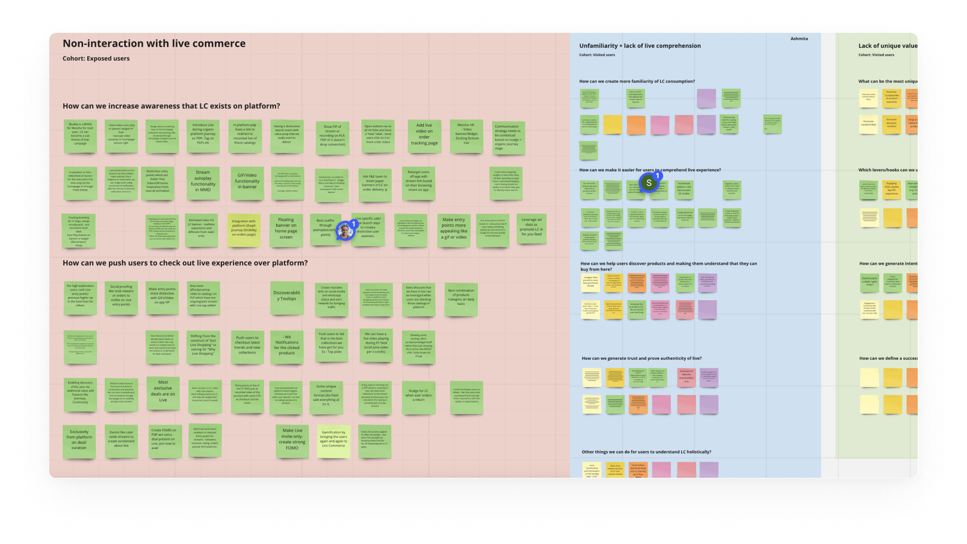
I organised a brainstorming session among all the collaborators including “D-level” employees to ensure I have ideas from entire team. The session was highly interactive and collaborative with more than 100+ innovative ideas across the entire live commerce journey. I collated all the idea buckets and further refined it to scope the problem and solution as per short and long term vision in collaboration with PM and Business Analyst. This activity also ensured we have a strong hypothesis to conduct a user research with diverse groups to find the right solutions for them.
Voice of users
I conducted structured research along with Product Manager across different regions of Delhi and Lucknow, these 27 users were based on their interaction on app, covering Live commerce cohorts- Interacted, activated and dropped off at different stages.
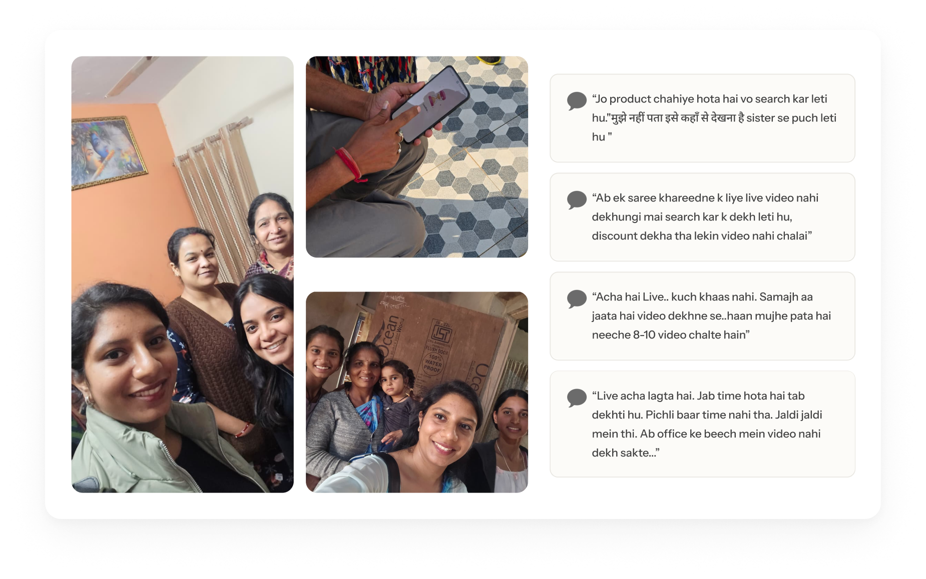
Based on all the insights we collated from everyone, these were the few problem buckets that were figured out.
| Problem bucket | What it meant | Solves proposed |
|---|---|---|
| Lack of awareness | Users didn't know live commerce was inside Meesho app, so they weren't looking for it | Distinct and noticeable · Video format |
| Lack of interest | Even when seen, nothing made them stop, as there was no clear expectation setting | Deals and discount · FOMO (time-sensitive) · Product first discovery |
| Poor recall value | Live's entry point blurred into every other offer banner, so it wasn't remembered as where the best deals live | Best deal in platform · More touchpoints |
Design iterations
Low fidelity
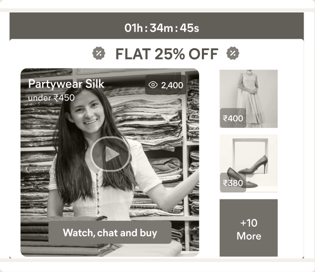
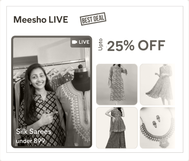
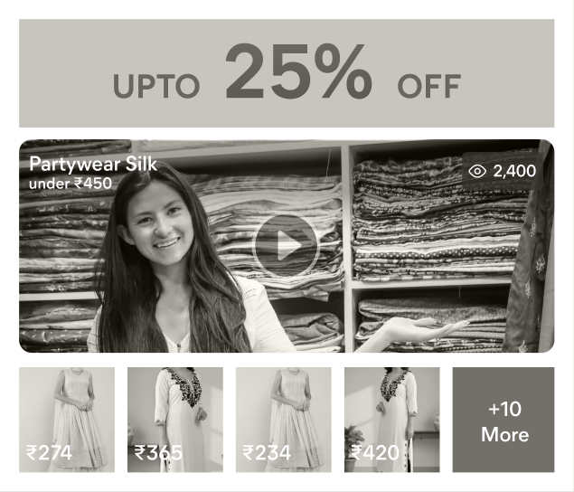
I explored different approaches like including cross-stream videos, adding "Shop a look" instead of one product shown, but we couldn't proceed with it since our audience was not ready for it yet, rather closed one video at a time view along with product variations. I presented the below low-fi ideas to internal team for broader alignment and feedback, and we decided to proceed with third option that is relevant from video format POV, and we also ideated the edge cases handling in case video doesn't load for users.
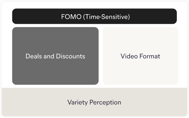
Option A
For deal seeker users, both discount and time-sensitivity are critical
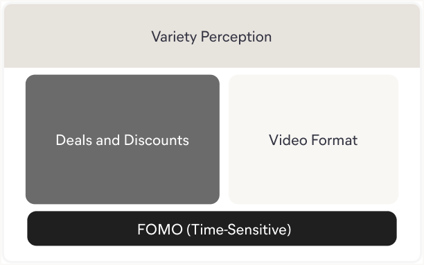
Option B
Brings variety upfront for user's concern if there will be just 1 product shown in video
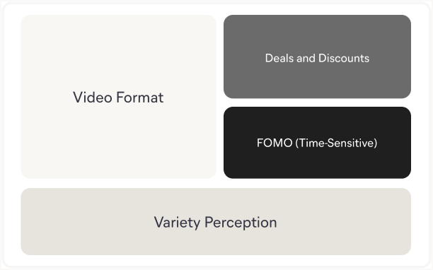
Option C, chosen
Provides clear visibility of video and consolidates the FOMO factors well
Wireframe
At this stage, the intent was to provide maximum space for video. I tested different layouts and how a seller would use their device to go live, and the vertical layout stood out from a feasibility and placement of product variants perspective.

Shipped
Final outcome
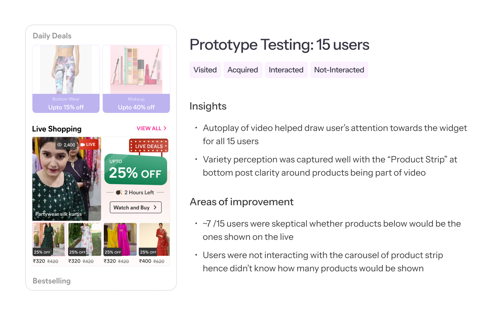
The home page stopped advertising the livestream and started being one. Where a static banner used to sit, the live video now autoplays with a strip of the actual products and prices underneath it.
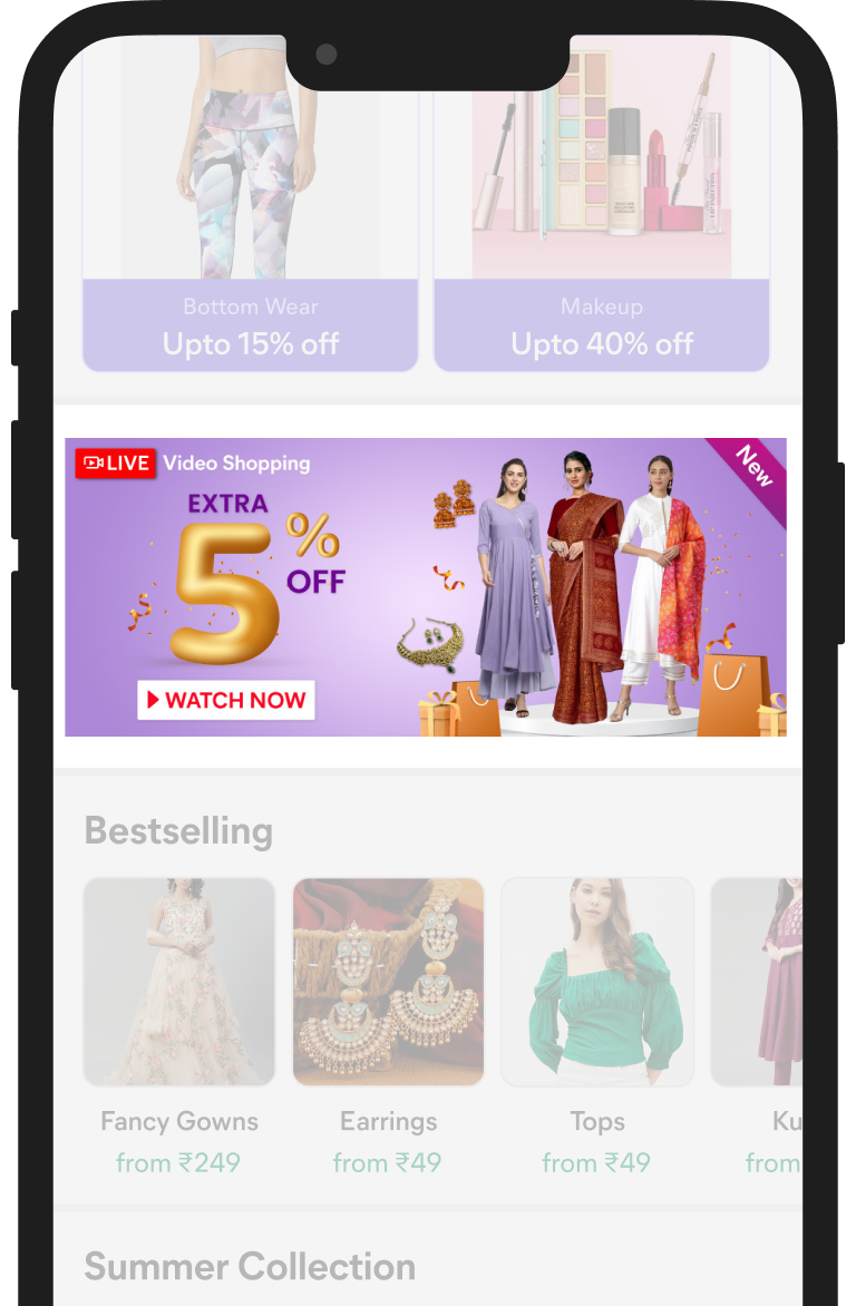
Before
After
Making it load mattered as much as the widget itself. The video preloads from app open, and when the connection cannot keep up it falls back to a seller curated static image rather than an empty box.
Impact
What the redesign delivered
Awareness was solved by putting the live, autoplaying widget on the home page instead of an ad for it. Interest came from the product strip beneath the video, which showed the actual products and their prices and drove 40% extra traffic from the first-time experience. Recall followed from both, since a user who has lived through a live-only price drop has a reason to come back for the next stream.
It ran as a controlled experiment against a holdout before it scaled, and the first read came back positive on every metric we had set.
71%
view activation, up from 11%, counting users who stayed with the video past 120s
33%
first order activation, up from 2%
2%
order contribution at platform level, a direct lift on NMV
Phase 2
Point-in-time discount
With people now arriving at the stream, the next question was what converts them once they are there. A time-boxed deal drops mid-stream on a countdown, with prices falling in real time. The feeling designed for was not "there is a discount", it was "this is ending."
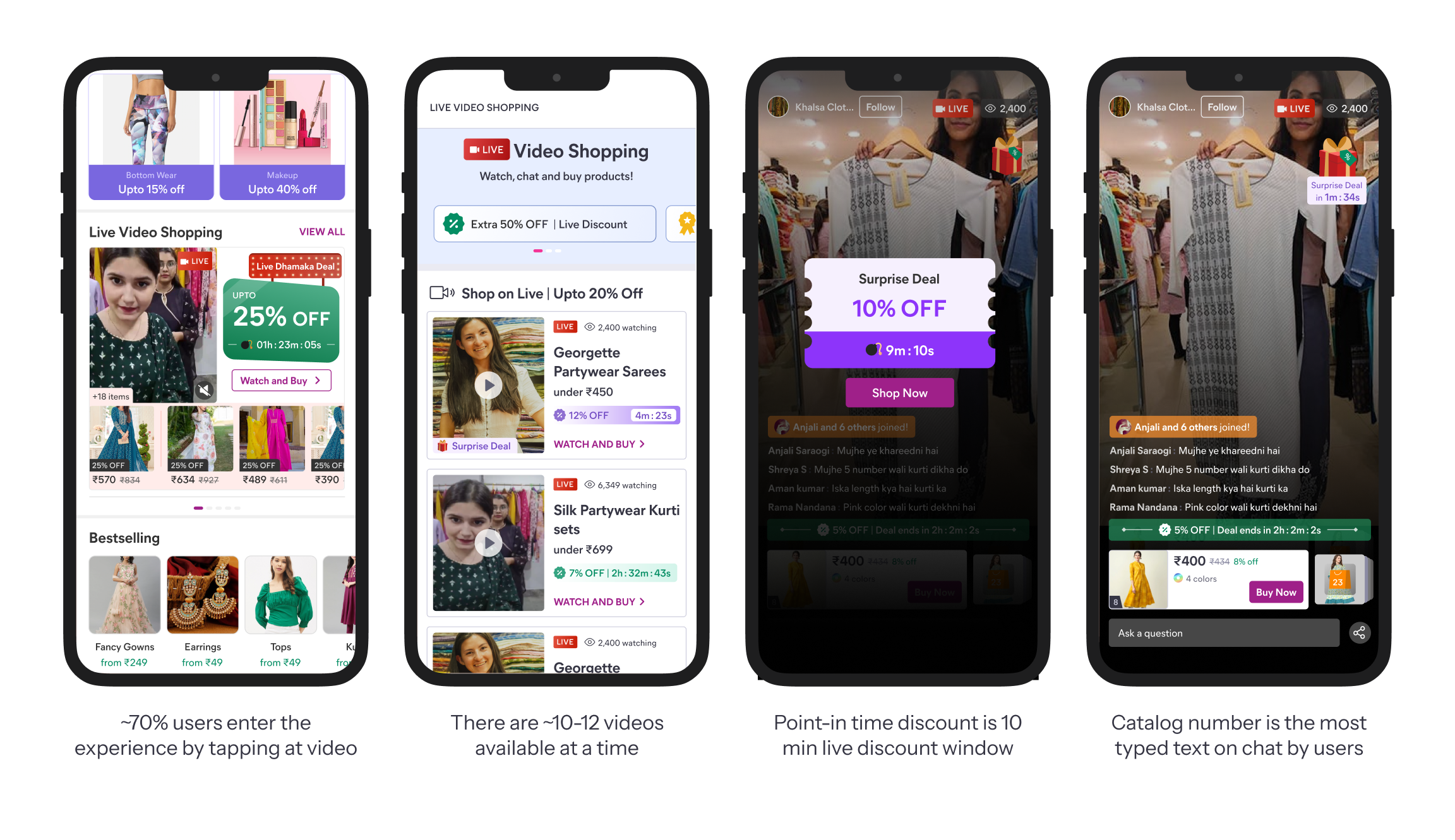
Designing the seller's half of the moment
As a discount that fires mid-stream has two sides, I worked on the seller end of flow as well. The seller is performer and operator at once, and cannot work a timer while selling live. The key account managers inform and train the sellers beforehand, and in fact a seller can decide how many such point-in-time discounts they want to provide for a particular stream from the seller dashboard. So the discount fires automatically, and a time-aware sequence keeps the seller ahead of each moment without requiring an action:
- Before live
- The seller knows which deals are included and when.
- Window nears
- "Starts in 3 mins" then "30 sec", lead time to prepare.
- Once live
- The buyer sees "ends in 10 mins". The seller narrates it.
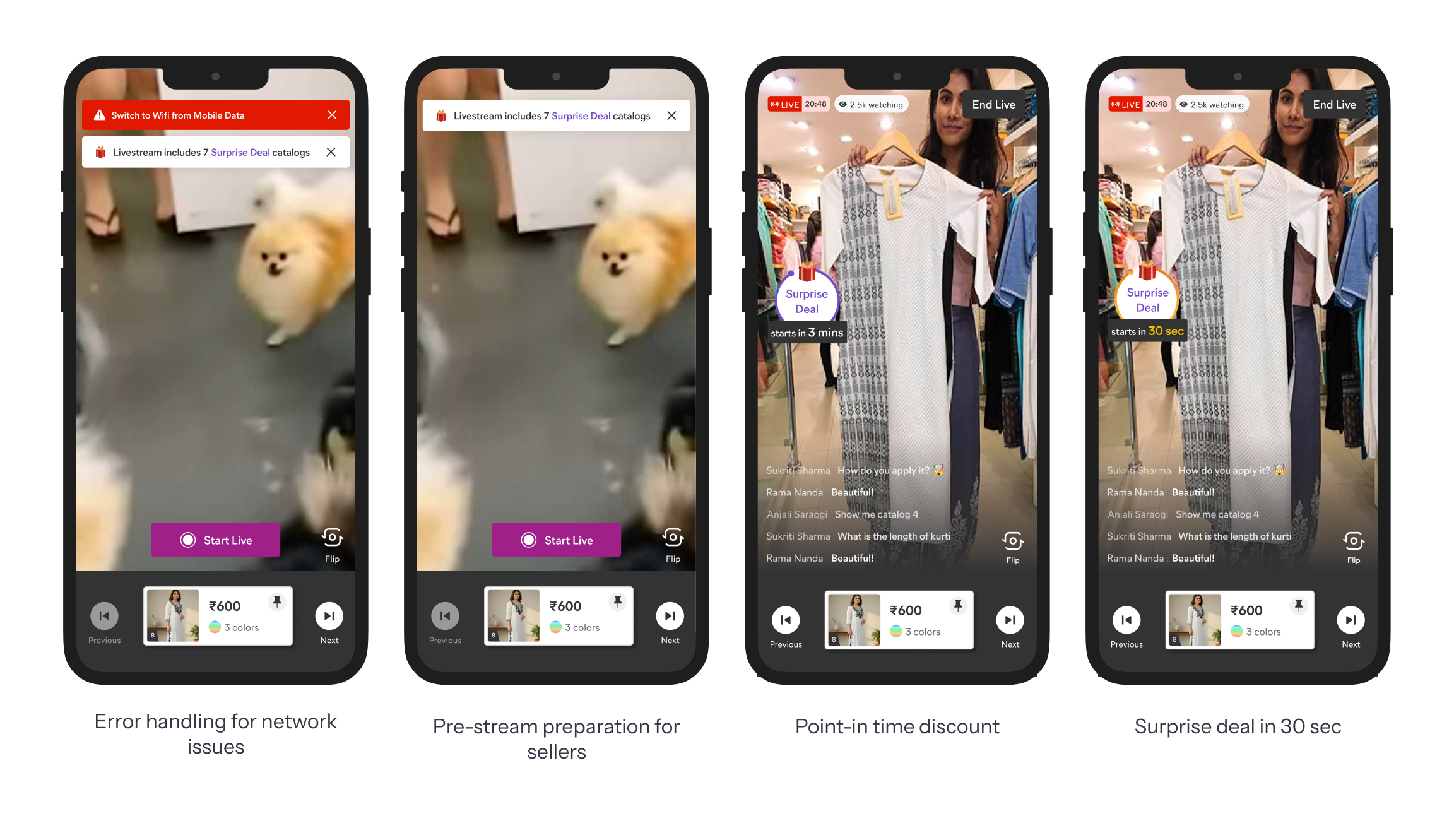
What I'd carry forward
The highest-leverage call on this project was to show rather than tell, putting the live video on the home page instead of an ad for it. The product strip worked for the same reason: our user is visual rather than content-led, and needs to see the products before giving a video their time. Getting the whole team in early mattered just as much, because agreeing on shared goals upfront meant there was no misalignment left to resolve at handoff.
What I would do differently is map the failure cases before the pitch. Live autoplay was the hardest thing to sell internally, and that was partly self-inflicted, because I brought the concept to the room without having worked through what happens on a low-connectivity connection first.
Shop-a-Look was the bigger concept that didn't ship. The room couldn't be aligned on it, so I chose to disagree and commit to the focused solve instead, and the signal that came later showed users weren't ready for it either. The instinct wasn't wrong so much as early, which taught me that reading when a user is ready is as much of the judgment as the idea itself.
There is more to this work...
Drawing parallels with SEA markets, prioritisation and trade-offs during brainstorming sessions. Get in touch for a complete walkthrough.