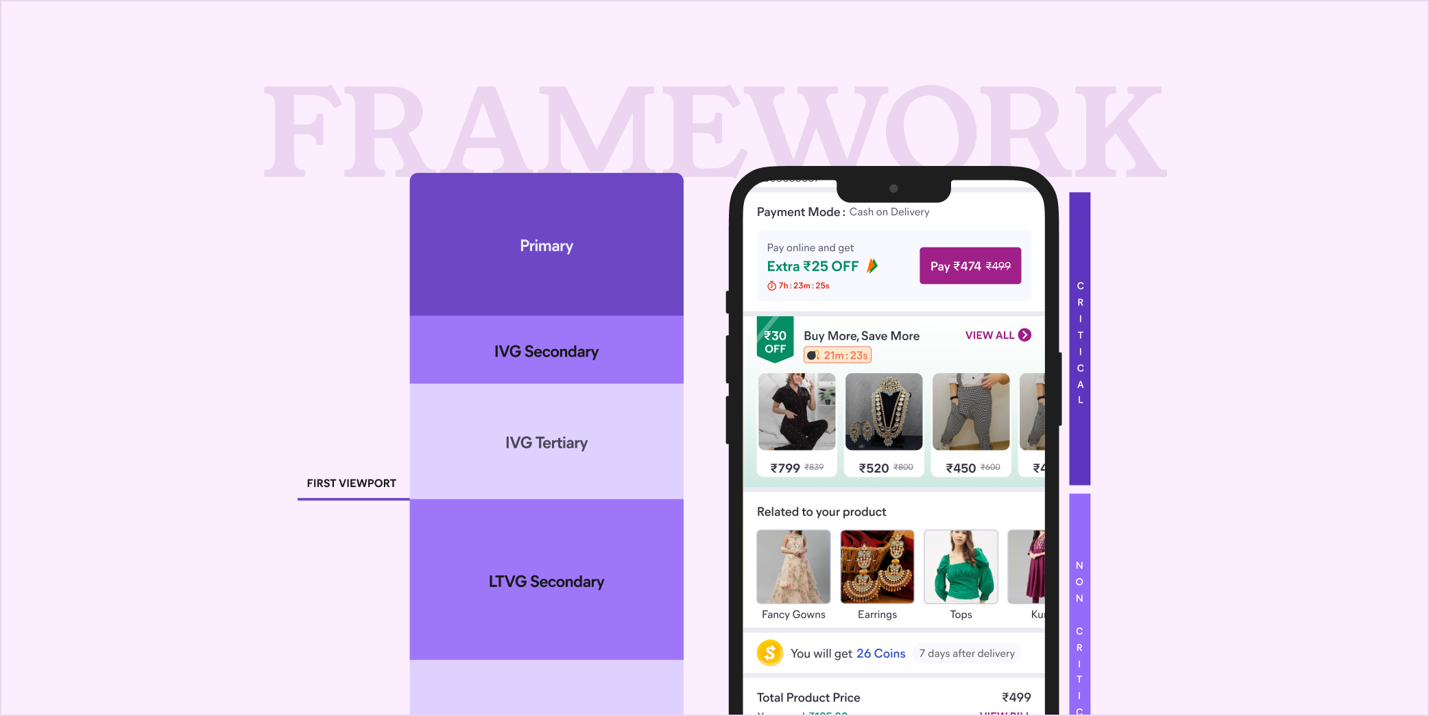
Post Order Framework
A governance framework that decides what every team can place, and where, across ~46 contending pods.
1-minute summary
Meesho was scaling fast, and ~46 pods across ads, rewards, merchandising and awareness comms all contended for the same finite space on the post-order page, where they could promote their programs like Buy more save more, Reward coins, and initiatives like Meesho Mall and Gold, with no rules governing where that communication needs to be placed and for how long, what happens at the return and exchange phases, and whether we still promote other features.
I owned the redesign of the Post Order experience and the design decisions for the page. I collaborated with Product Managers and Business Analysts across multiple PODs and discussed their core check metric and success metric. Coordinating a single placement required manual alignment across designers, PMs and product leadership.
I shifted from policing individual placements to governing the surface, with a framework of ranked objectives, a competitor benchmarked slot model, and prioritisation principles any team could apply without re-litigating the basics.
Alignment that earlier took nearly one week across designers, PMs and product leadership now happens in a single meeting.
The framework was presented to a room of CXOs and directors across engineering and product, approved, and rolled out org-wide.
1 call
for alignment, down from a week
~46 pods
self-serving into a governed structure
Context
What is Post Order Experience?
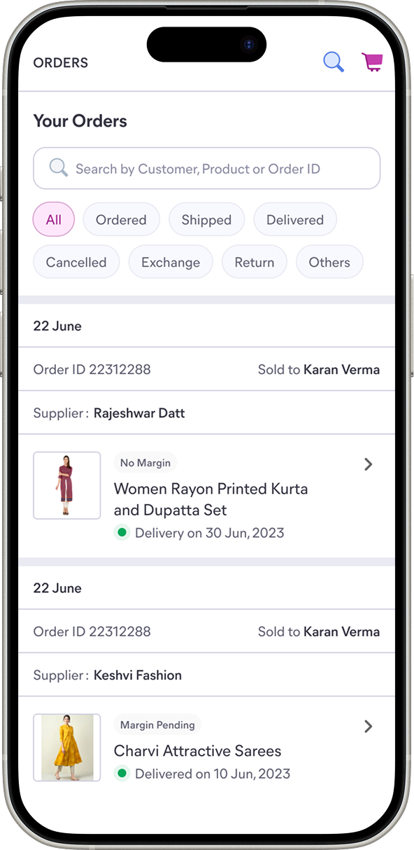
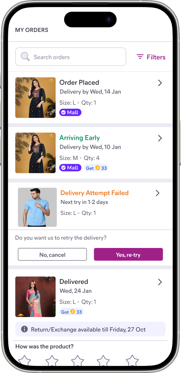
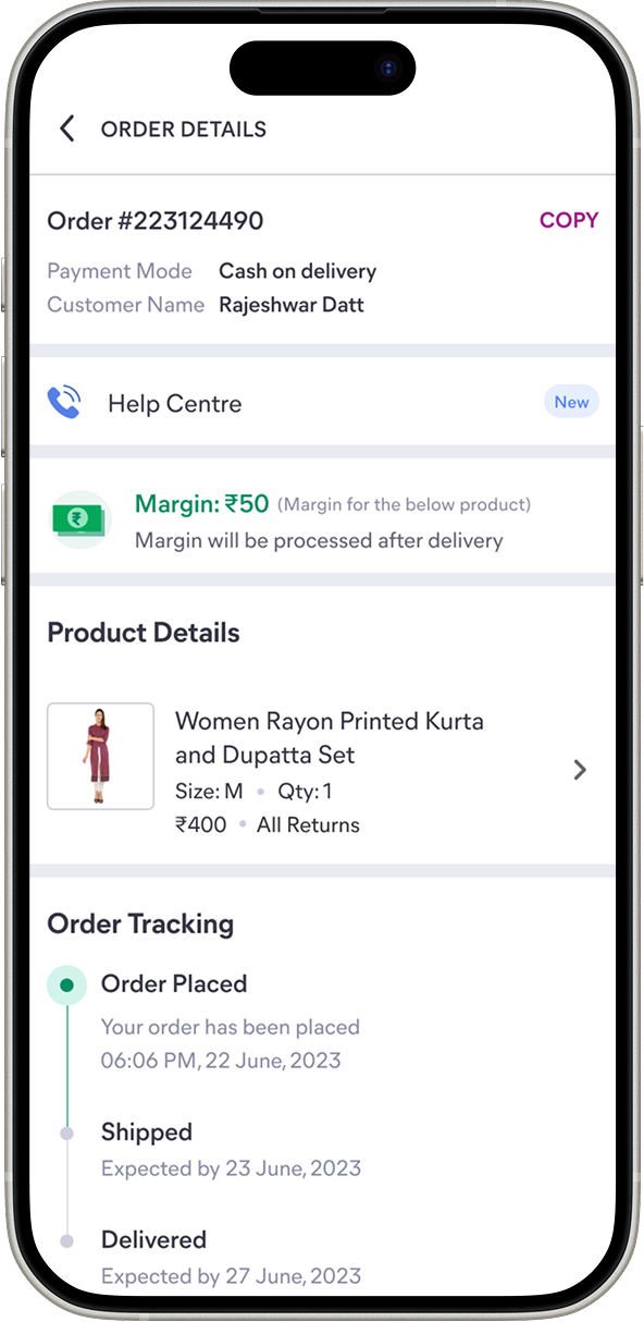
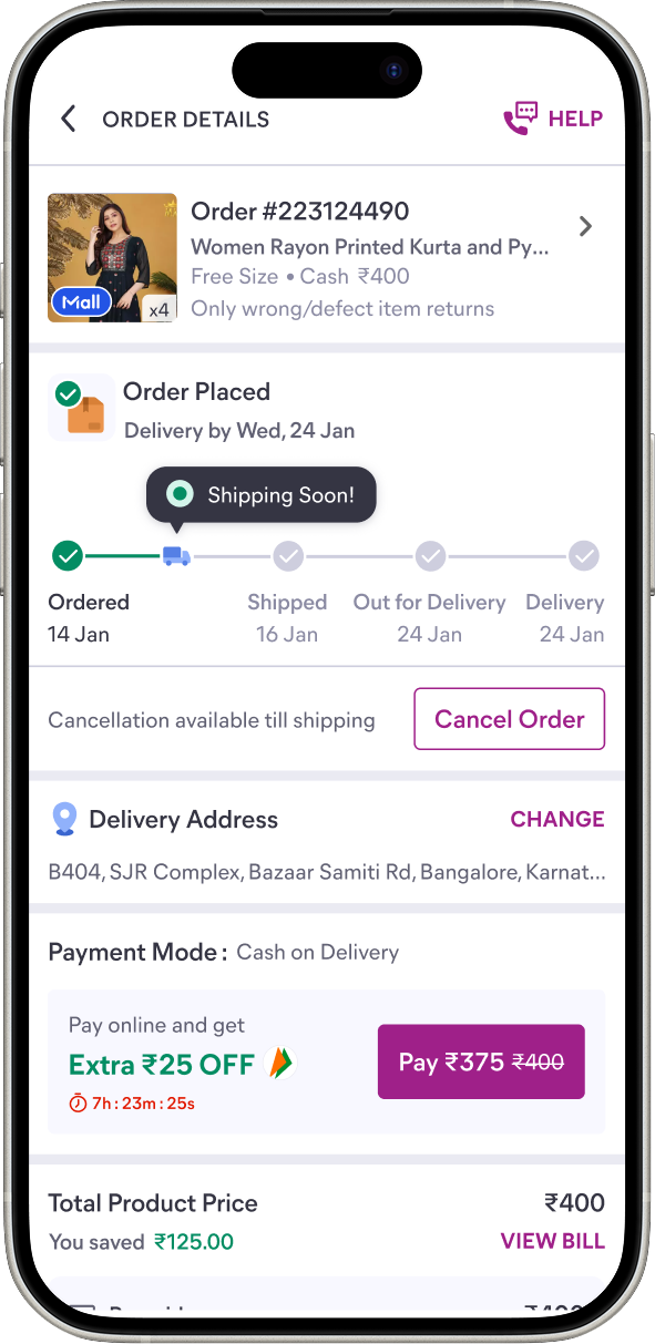
This journey starts after a user places an order, and covers touchpoints including the order confirmation page, the order listing page and the order details page. It supports both happy-path tracking as well as returns and exchanges.
Before the framework, I owned the Post Order redesign end to end. Prior to redesign, the trigger was measurable: users frequently contacted support asking, "Where is my order?" At the September baseline the experience was running at 7.21% calls per order, costing ₹0.96 per delivered order.
The redesign surfaced order and tracking information much earlier in the experience, which brought calls down by 22% and cost per delivered order to ₹0.30.
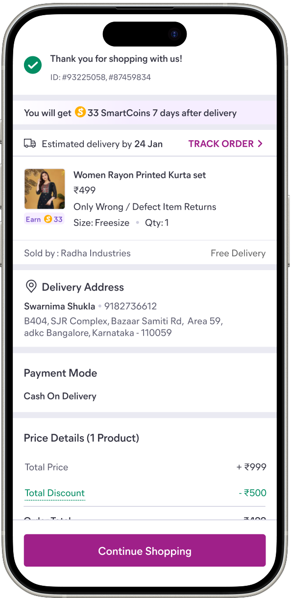
Order confirmation page (New)
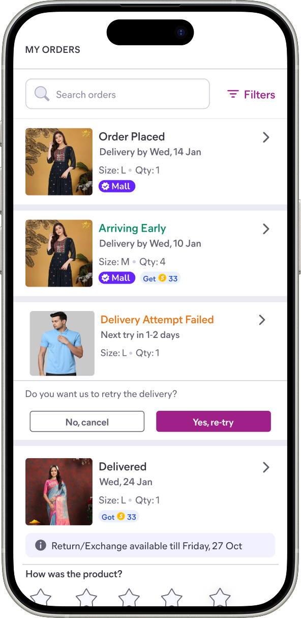
Order listing page (New)
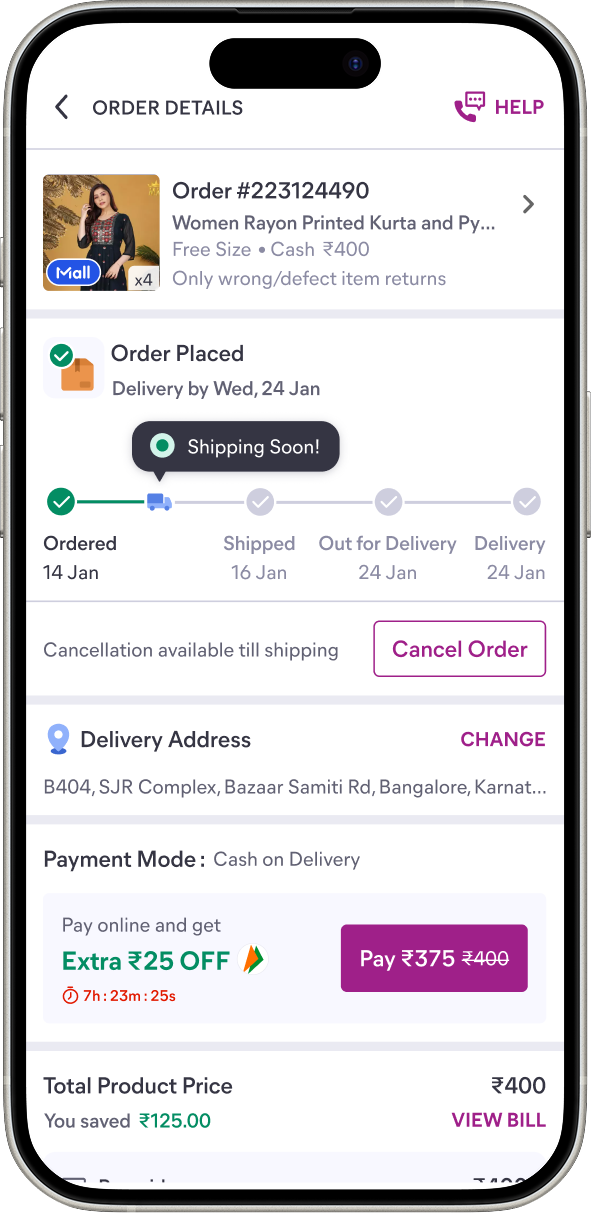
Order details page (New)
Background
The redesign that revealed the need
Users were calling support in volume to ask where their order was, which is exactly what the order details page exists to answer. The pages were redesigned so that order and tracking information led, answering the question on the page rather than in a call centre.
Problem
How an ungoverned page degrades
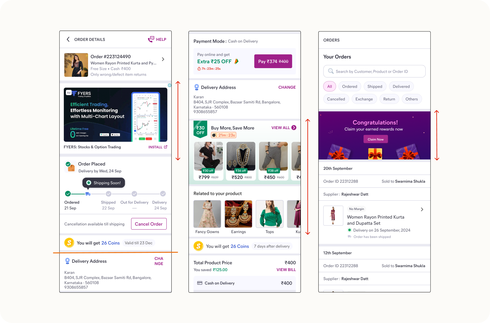
~46 pods across ads, rewards, merchandising and awareness comms, much of it time-bound, contended for the same finite space. Coordinating one placement was a manual chase, and many teams never started the chain at all. The page degraded on its own, in three ways:
- Real-estate creep
- Unrelated content takes disproportionate space, pushing down primary information like the delivery address.
- Feature stacking
- Too many guidelines led to stacking without an impact-focused approach.
- Distraction banners
- Absent content-design rules produced banners that bury relevant information.
The routine failure was familiar: someone opens the app, often a manager or the CEO, and finds a bright ads banner burying the order status. The real problem was that a surface owned by everyone was governed by no one.
Approach
From policing the page to governing it
Catching bad placements one at a time does not scale. The page did not need a more watchful designer, it needed a system that made good placement the easy path and bad placement structurally hard, so that coordination did not depend on being in the room.
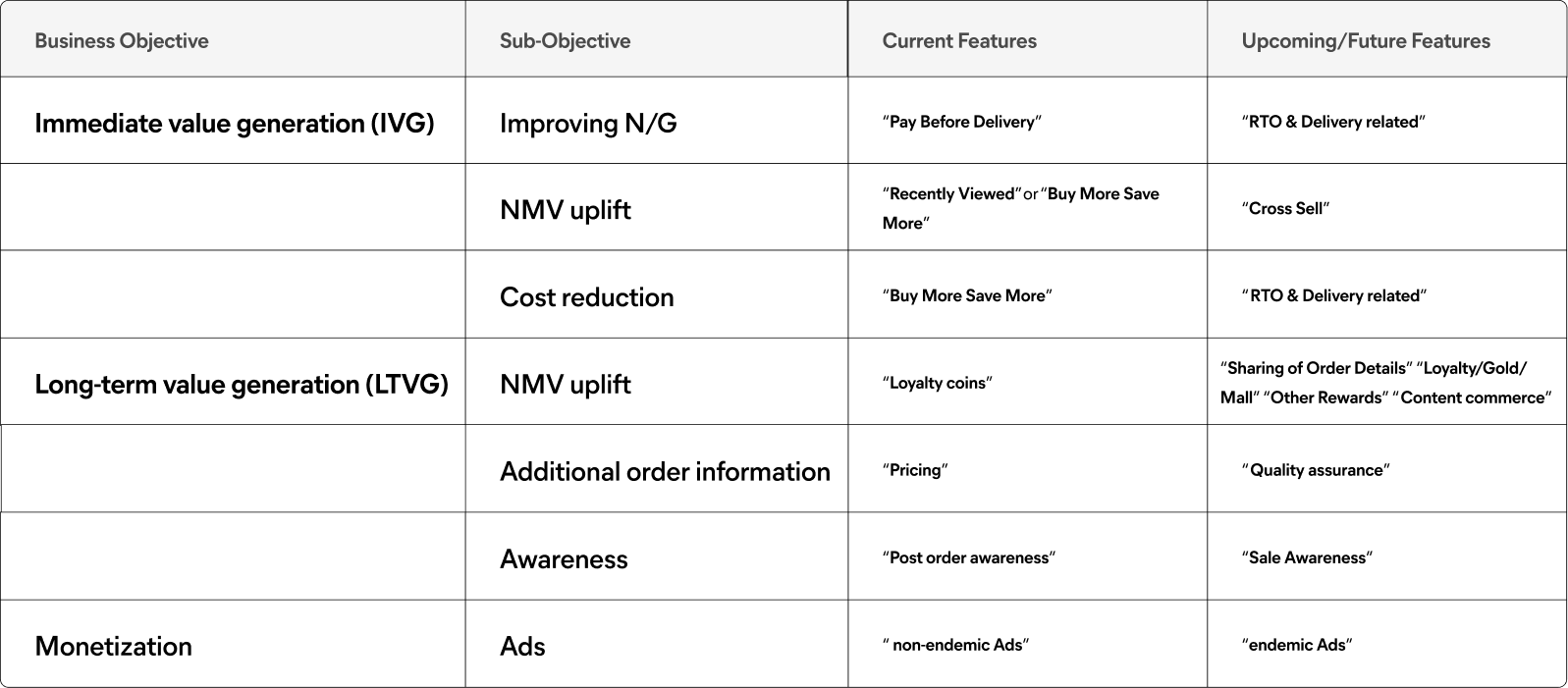
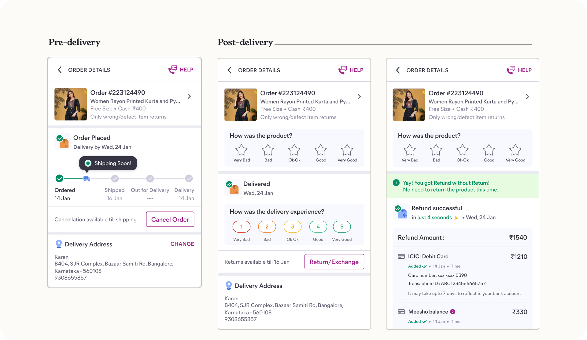
I worked with a staff designer to bucket the features by the value they bring to the business and to users, who helped me think long term and not just bucket the current features but the potential future ones. We also worked across the stages of the post order experience: pre-delivery, post-delivery, and the happy, edge and error cases.
The model
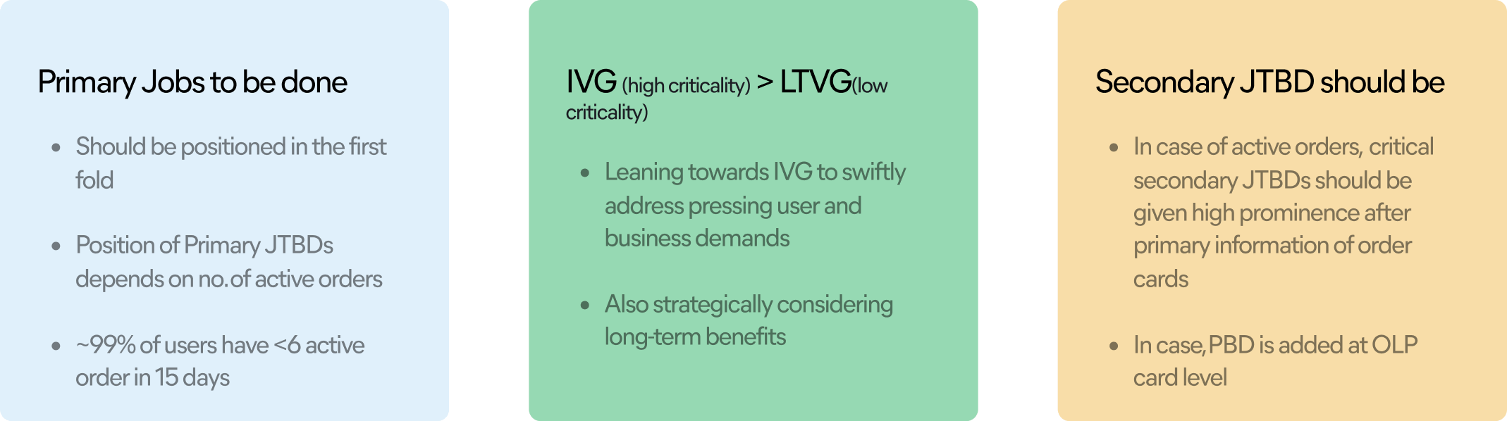
Jobs first, ranked by criticality
Competitor benchmarking across Amazon, Flipkart, Myntra and Nykaa grounded the slot ratios in how the category actually behaves rather than in a guess. Every element wanting space is classified by the job it serves, those jobs are ranked, and the principles are written into a fixed slot count so that how much can go here stops being negotiable.
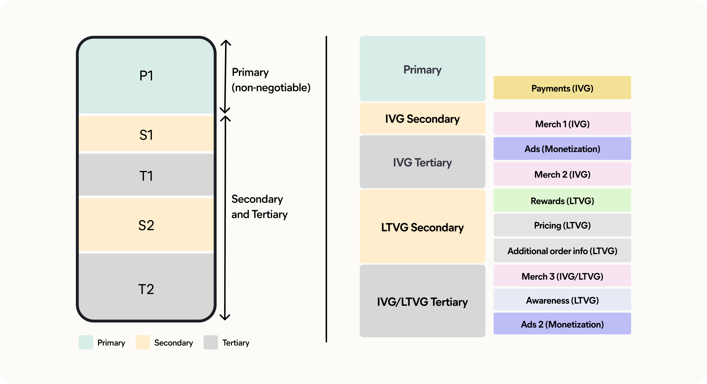
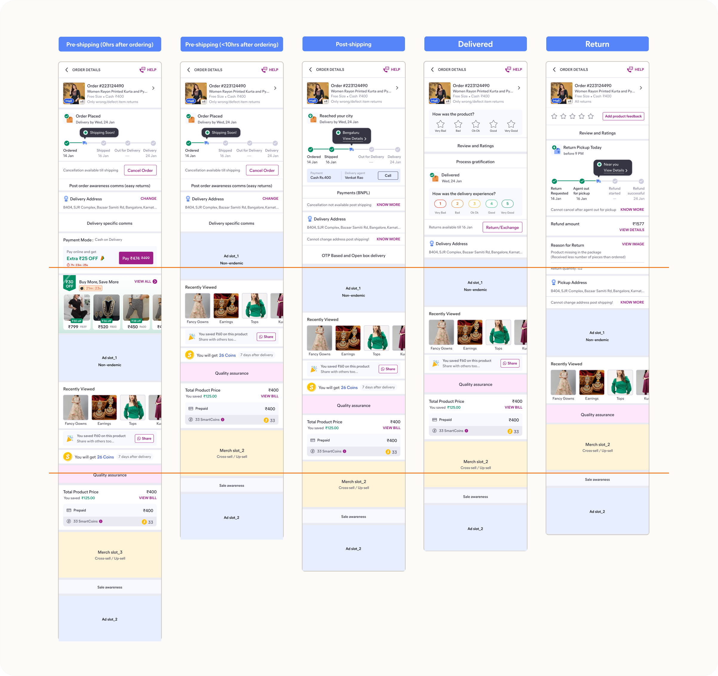
The redesign taught me what the metrics did not: a clean page does not stay clean. A tidy redesign would last weeks, and without rules for how it evolved it would degrade straight back. That is what became the framework.
Rules
Specific enough to remove judgement calls
A framework only governs if it is specific enough for engineering and design to apply directly, so it sets height and zoning rules, colour and movement constraints, and prioritisation principles that settle disputes as a lookup.
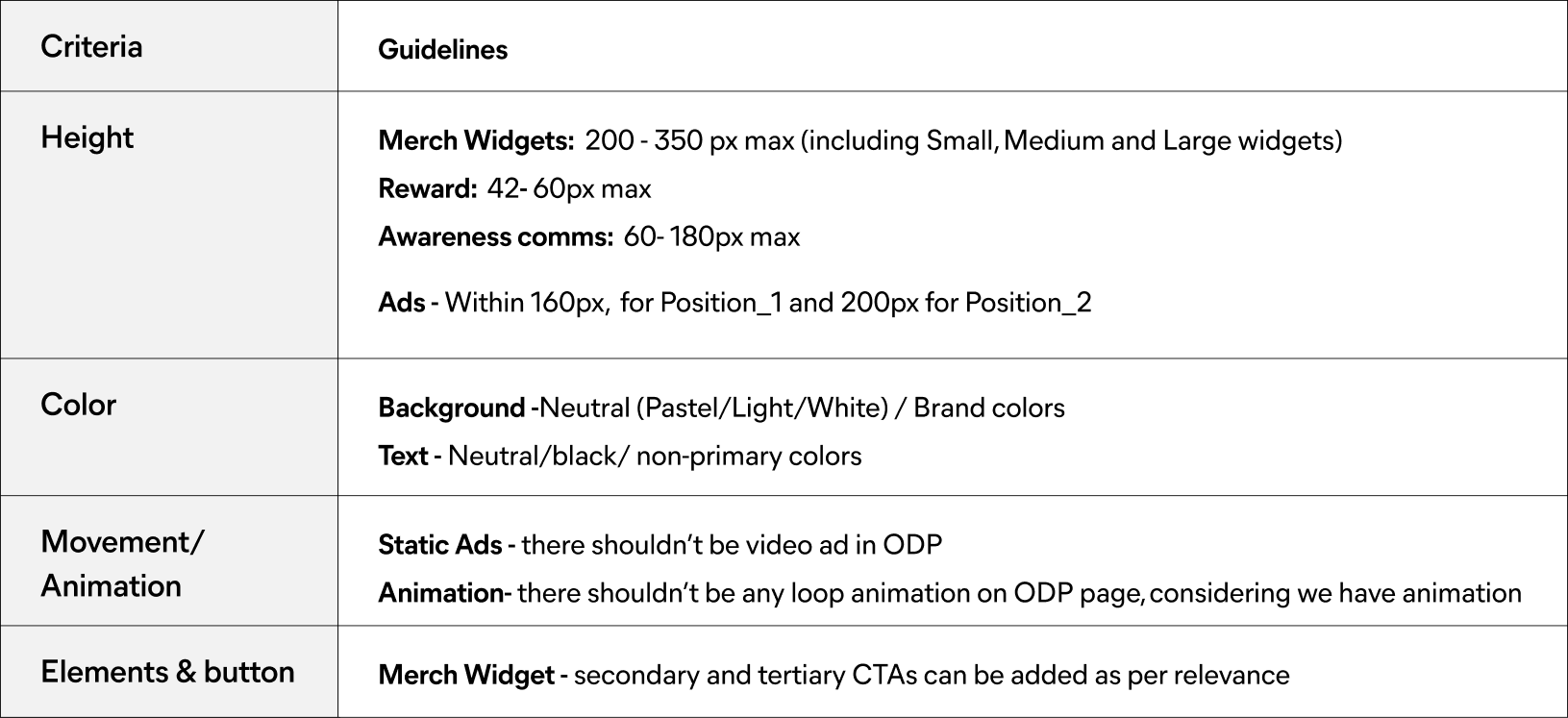
The system stays alive. Every team logs its slot usage: what they placed, the metric tracked, and the expected impact. The framework stays a current map of the page rather than a document that ages out.
Impact
Alignment that took weeks now takes a call
The framework was presented to a room of CXOs and directors across engineering, product, and the pods whose teams would live by it. It was approved and rolled out org-wide.
1 call
for alignment, down from a week
~46 pods
self-serving into a governed structure
Concerns were answered by the framework rather than by negotiation, which protected the redesign's original gains and stopped the page degrading.
What I'd carry forward, and what's next
A framework's value is its adoption, not its elegance. The win came from designing for self-service, specific enough that teams could act without needing the author in the room. The CXO and director buy-in mattered for the same reason, because a governance system only governs if the people it governs are aligned on it.
What comes next is automation. The live slot log already captures every placement and its impact, so the natural step is turning that into a more automated way to judge whether a slot still earns its place: governance that does not just hold the line but optimises it.
There is more to this work...
Board room discussion, slot closure, implementation across PODs post launch. Get in touch for a complete walkthrough.